Most people don’t think of paint color when they picture a productive office, but the choices on the walls can do more than just look nice. Color changes how people feel without them realizing it. It can shape energy levels, mood, and even how well people stay focused during a long workday. When the right shades are used in the right places, the results aren’t just aesthetic — they can make a difference you actually notice in how the day flows.
In a busy office environment, it’s normal to lose a little steam after lunch, feel overloaded during back-to-back meetings, or struggle to stay upbeat under stress. The color of the walls won’t change your calendar, but it can help make the space more comfortable and balanced. Picking colors strategically gives your team a chance to feel better supported by the space they’re working in. It’s a small shift that can lead to calmer heads and better attitudes without major upgrades or full renovations.
The Psychology of Colors
Colors are more than decoration. They interact with how people feel and behave throughout the day. Certain shades are tied to calmness, energy, creativity, or focus. We’ve all felt this connection, like how some rooms feel relaxing without knowing why, or how others can feel loud even when they’re quiet. That’s because the color does part of the emotional and mental work.
When choosing office paint colors, it helps to think about how each room is used and what atmosphere is needed in that spot. A quiet corner for focused work may benefit from calming tones, while open areas with group activity could use something a little brighter to lift the mood. Here’s a breakdown of how common color families tend to affect the brain:
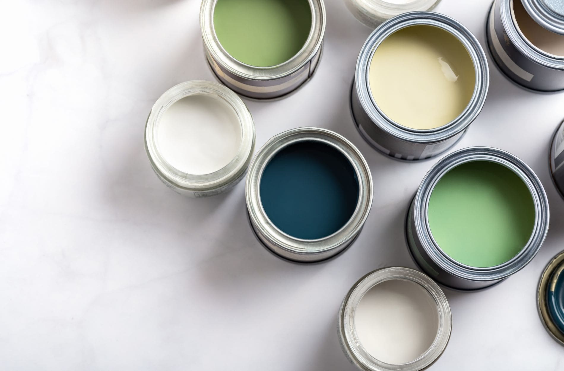
- Blues are known for their calming effect. They help lower tension and make it easier to concentrate. Soft or medium shades are great for individual offices or shared work zones where focus matters.
- Greens feel fresh and are easy on the eyes. This color creates a sense of balance and works especially well in offices with lots of screen time. It helps reduce that drained feeling by giving a mental reset.
- Yellows bring energy and help wake up creativity. In small amounts, they’re great for rooms where new ideas matter. Think brainstorming spaces or design departments.
The goal is not to overload with color but to support the kind of space you’re trying to create. Offices don’t have to be gray or beige to look professional. A thoughtfully chosen paint scheme can boost morale and help people feel a little more in sync with their environment.
Best Paint Colors for Increasing Productivity
Certain colors do more than brighten a wall. They can help make a workspace feel more focused and less draining after long hours. Productivity doesn’t always come from caffeine or stricter schedules. Sometimes, it’s about working in a space that feels steady and clear. Choosing the right paint colors can support this by shaping how the office feels day after day.
Here’s a closer look at some top choices for boosting focus and work output:
1. Blue
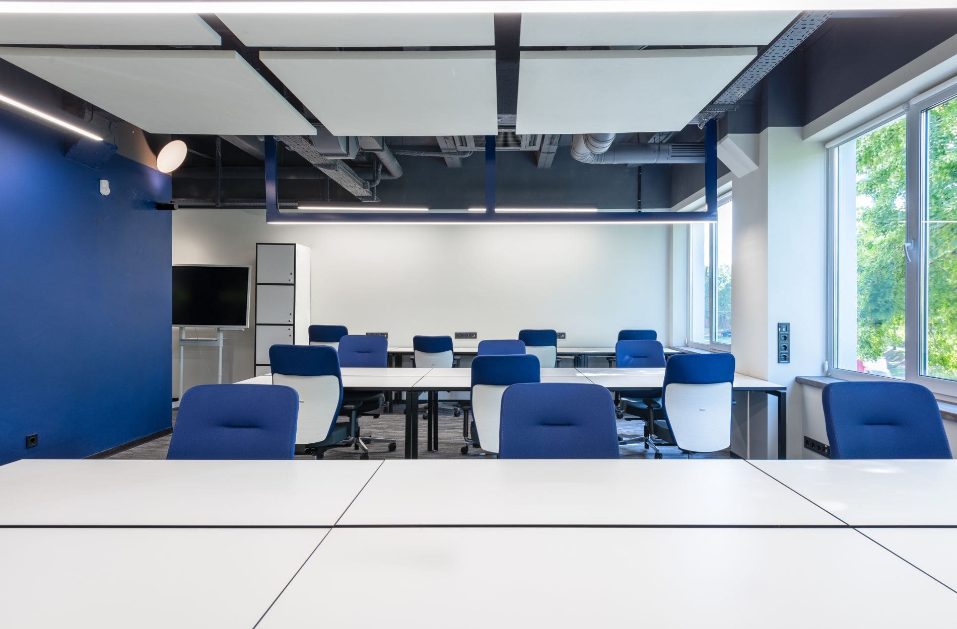
This is one of the best colors for places where concentration is key. Blue helps calm the mind and encourages a steady pace. It doesn’t distract and pairs well with clean lines and minimal decor. Mid-toned blues work well in offices with natural light, while deeper navy tones look sharp in executive desks or private offices.
2. Green
Often found in nature, green has a grounding effect. It helps reduce eye strain and supports longer work sessions. If your team spends hours at screens, a soft green wall in the office can give a visual break and a gentler atmosphere. Sage or olive shades are popular in modern spaces because they’re subtle but still refreshing.
3. Yellow
While not ideal for walls across an entire office, yellow used wisely can help stir up new ideas and alertness. It’s a good choice for creative departments or areas meant for collaboration. Consider pale yellows or warm golden tones for accent walls or specific project rooms. Too much yellow can feel intense, so using it as a pop rather than the base is usually more effective.
Every office functions differently, so pairing the purpose of the space with the color choice can make all the difference. Whether you’re aiming to bring more calm into a hectic space or sharpen the focus in a shared workroom, color can help guide how people show up and perform each day.
Best Paint Colors for Boosting Morale
Keeping a workplace productive is important, but so is helping people feel good while they do the work. Morale plays a big role in how teams approach tasks and interact with each other. When office walls reflect warmth or comfort, people are more likely to feel relaxed and appreciated. Even small amounts of color make a difference when they’re thoughtfully placed.
Here are a few great options for creating a more welcoming, uplifting environment:
1. Blue
This is one of the best colors for places where concentration is key. Blue helps calm the mind and encourages a steady pace. It doesn’t distract and pairs well with clean lines and minimal decor. Mid-toned blues work well in offices with natural light, while deeper navy tones look sharp in executive desks or private offices.
2. Green
Often found in nature, green has a grounding effect. It helps reduce eye strain and supports longer work sessions. If your team spends hours at screens, a soft green wall in the office can give a visual break and a gentler atmosphere. Sage or olive shades are popular in modern spaces because they’re subtle but still refreshing.
3. Yellow
While not ideal for walls across an entire office, yellow used wisely can help stir up new ideas and alertness. It’s a good choice for creative departments or areas meant for collaboration. Consider pale yellows or warm golden tones for accent walls or specific project rooms. Too much yellow can feel intense, so using it as a pop rather than the base is usually more effective.
Using these colors doesn’t mean turning the whole office into a bright canvas. Even a single wall can lighten the mood or change how a person feels in that space. Applied with purpose, they leave a lasting impact.
Tailoring Color Choices to Different Office Areas
Colors don’t have to be used the same way across the entire office. Different areas serve different functions, and paint has the power to help support those roles. What works for a break room may not be the best fit for a conference room. Here’s a quick look at how color can be used area by area:
Meeting Rooms
Go with calming but focused tones like charcoal blue, sage, or light gray. These shades help keep energy steady and focus sharp, which suits spaces meant for long planning sessions or group discussions.
Break Rooms
Choose cheerful or soothing colors that help transition people out of work mode for a few minutes. Soft orange, warm beige, or mint green all work well. These offer a mental pause without making the space feel overly dull or sleepy.
Open Workspaces
Try balanced color combinations. Muted green or light blue as a base, blended with white or off-white, is uplifting without being distracting. In offices with lots of desks and foot traffic, color can shape how people move and concentrate.
Reception Areas
First impressions count. Soft lavender, clean white, sandy neutrals, or warm gray give a professional appearance with a touch of comfort. It immediately puts guests and teams at ease.
Matching color to purpose keeps the atmosphere consistent with what workers and guests need to feel. It’s not about being fancy, it’s about feeling right.
Creating a Cohesive Office Environment
Once specific rooms and their colors are planned, it’s worth thinking about how those colors move from one space to the next. A well-coordinated paint scheme helps tie everything together, creating unity across the office instead of making each room feel separate or offbeat.
Here are a few ways to keep things coordinated:
- Stick to a common palette. Choose two to four main hues that blend well together and assign them roles across the office. For example, base tones for walls, accent tones for smaller areas or trim.
- Balance color intensity. If one room has a bold color, tone it down in neighboring areas. This keeps transitions smooth without feeling jarring.
- Use neutrals to anchor bold tones. Soft whites, grays, or beige tones work well as background colors that allow brighter walls or trim to pop without overloading the space.
- Reflect the brand where it makes sense. Softly bringing in brand colors, such as in hallways, doors, or furniture, can make a workspace feel connected to company identity without going overboard.
- Think about lighting and layout. Natural light changes how paint looks. Spaces with lots of windows might need cooler tones to avoid harsh reflections, while dimmer areas do better with warm paint options.
The goal here is to go for balance. A smart paint plan feels intentional and easy to move through, helping people feel comfortable from one room to the next.
Why Working With Professionals Makes a Difference in Anaheim, CA
Choosing the right paint colors can take time and an eye for detail, but getting those choices applied correctly is a whole other step. Especially for offices in Anaheim where function and appearance both matter, bringing in commercial painting professionals can make the process smoother.
Experienced crews know how to prep mixed-use spaces, work around business hours, correct wall issues before painting, and apply finishes that last. That matters when paint affects how people work, meet, and interact.
In cities like Anaheim, temperature and moisture changes from near-coastal weather also impact how paint behaves over time. This makes surface prep and product choice even more important, especially inside office buildings that deal with AC systems and lighting variations.
A professional team doesn’t just get the job done. They help make sure the paint stays fresh, functional, and aligned with the goals of the workspace. It’s less about rushing through rooms and more about delivering results that continue to support a positive, productive office long after the paint dries.
Let Color Do the Work
Color shapes how people feel from the moment they step into a room. A thoughtfully painted office can help encourage steady focus, boost energy during the workday, and provide quiet relief in high-pressure moments. These changes aren’t loud or flashy. They create a quiet foundation for people to feel supported in their work.
With the right mix of calming and energizing tones, and a plan that takes each room’s role into account, even an average workspace can feel more efficient and welcoming. For offices across Anaheim looking to refocus their layout or mood, paint color offers one of the easiest ways to start fresh without moving walls or buying new furniture. It’s one of those upgrades that feels small but stays with you every day.
Ready to transform your office into a more vibrant and productive space? Learn more about our commercial painting services and discover how Custom Painting & Decorating, Inc. can help create an environment that supports your team’s well-being and productivity. Let’s make your office a place where colors do more than just decorate—they inspire.


