Modern exterior paint color schemes make a house stand out from the street with a vibrant, carefully-chosen combination of colors.
The perfect mix of base color, trim and accents can bring out the architectural details and instantly boost curb appeal.
It’s especially important in places like Orange County, Ca where the bright sunshine, the sea air and all the different types of homes all combine to make the colors look totally different outdoors.
What Makes An Exterior Color Scheme Feel Modern?
A modern exterior color scheme has the knack of feeling on-trend because it doesn’t look like some afterthought. It looks intentional, rather than cluttered up with loads of distracting colors that don’t necessarily go together.
Contrast plays a huge part in making an exterior look good. Pairing light walls with dark trim, soft neutrals with black windows, or muted siding with a rich front door can create all the structure you need without making the place look too busy.
It goes without saying that the architectural style of the house matters. A modern color combo might look completely out of place on a bungalow or a colonial style house.
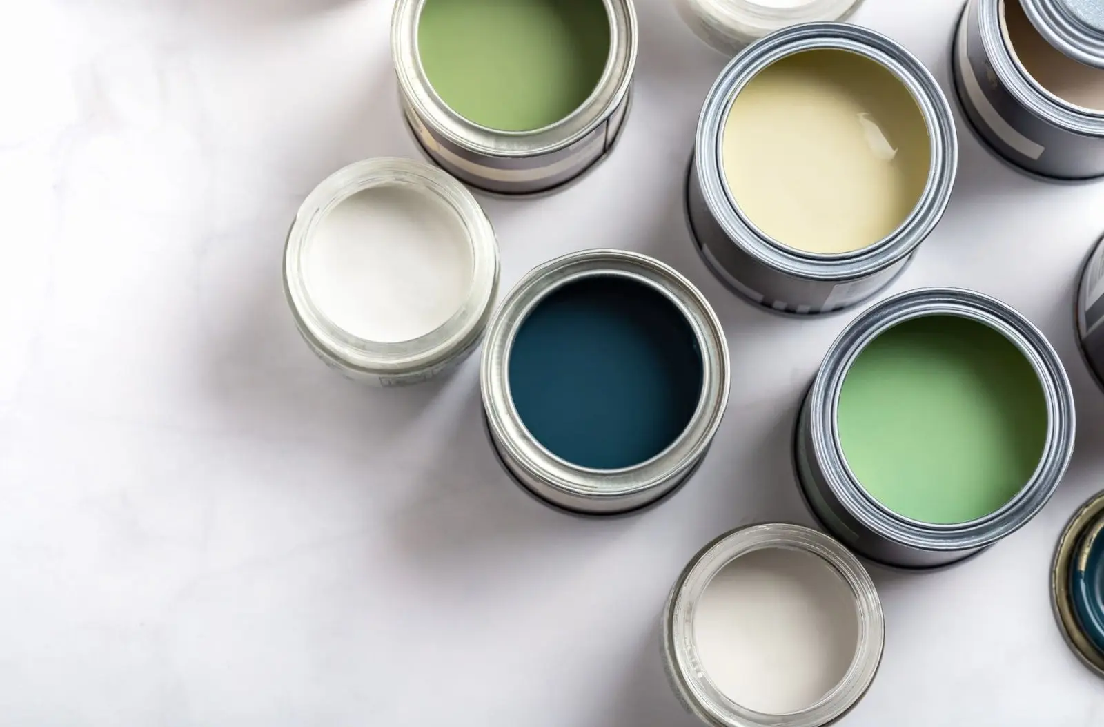
Top Modern Exterior Paint Colors Trending Right Now
Exterior color trends are often a reflection of the broader shifts in design, architecture and the use of materials. With natural textures, simpler lines and mixed surfaces getting more and more popular, it’s no surprise that color palettes have followed suit.
In other words, we’re seeing more depth but with a lot more restraint. Here are the top colors giving modern exteriors a bit of an edge.
- Warm greige and earthy neutrals are popular because they feel soft and versatile, and yet they lift the whole place without making it look cold.
- Deep charcoal and slate tones are really being sought after for their bold, architectural look. These shades pair well with warm wood doors, white trim, brushed metal hardware and concrete surfaces.
- Crisp white with bold contrasts is still going strong because it’s timeless, yet still looks sharp and modern when you pair it thoughtfully with things like black window frames, dark shutters, some natural wood accents and matte dark front doors.
- Sage green and muted olive have caught people’s eye because they connect the house right back to its surroundings and bring in a nice, calm organic feel. They look especially strong when paired with off-white trim, bronze fixtures, some tan stone and natural wood elements.
- Navy Blue and Moody Shades create a sense of depth and sophistication without the harshness of pure black. They pair well with bright white trim, soft grey stone, warm cedar accents and muted brass or iron details.
Factors That Shape The Right Exterior Color Scheme
Choosing an exterior scheme is far from random, even when a color looks great on its own. What actually works best usually comes down to how different visual elements interact with each other all across the property.
These are the factors that determine whether an exterior color scheme comes together cohesively.
Architectural style of the home
The design of your home sets the bar for what looks visually right. Sleek and modern homes tend to look best with sharp contrasts and simple color palettes while more ornate style properties do better with layered neutrals or historically accurate combos.
The surrounding landscape and neighborhood palette
The trees, the hardscaping outside your home, the colors of the houses next door and even the vibe of the street can all have an impact on how a particular color looks in context.
What may look great in a coastal neighborhood might look too harsh or too muted in a more inland area.
Natural lighting conditions
The way your home looks in morning sunlight, in the afternoon when the sun is high and in the shade are all going to change up the way the paint looks outside.
In Southern California where the sunlight is really strong, pale colors can look even paler, while darker tones come out warmer or more intense depending on how much sunlight they get.
Fixed elements
Your roof, brick, stone, pavers and driveway are all permanent fixtures of your property that add permanent colors to the mix.
Many pros will tell you that these fixed elements can actually be more of a guide for your color palette than the siding itself.
Regional climate and how it affects color perception
Your local climate will influence both the overall mood and how your colors look. For example in some parts of Orange County like Brea, Capistrano Beach or Costa mesa the sun, salt air and dust change up how certain tones look over time especially on stucco, wood and fibre cement exteriors.
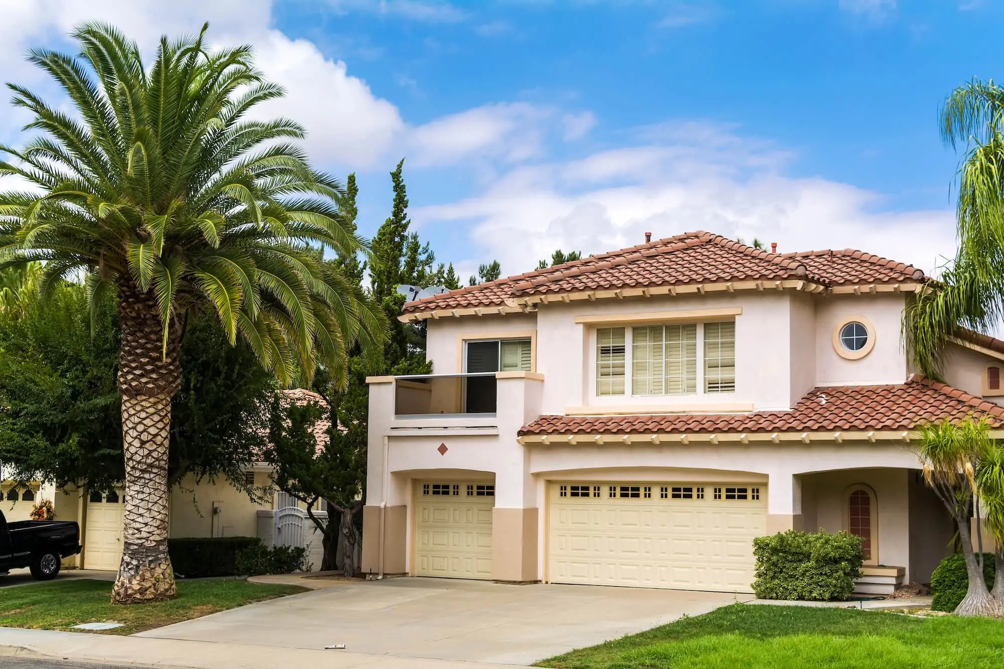
Modern Exterior Color Schemes By Home Style
Home style tends to naturally funnel the options down to a pretty narrow range of colors that just feel right for the exterior.
Below are some modern color scheme ideas we’ve put together which suit 5 of the most common home styles.
Contemporary And Minimalist Homes
These houses look their best in crisp color palettes with a subtle contrast. Soft white, charcoal, and warm grey with black accents all come together to make a really streamlined look that just makes the whole place feel more put together.
Craftsman And Bungalow Exteriors
Craftsman and bungalow homes tend to do pretty well with colors that ground the whole structure; colors that play off the trim details and add depth. Olive, taupe, deep blue-grey & soft off-white are some of the colors that work well together.
Farmhouse And Rustic Styles
Farmhouse exteriors usually go for a relaxed and polished look using warm whites, soft beige, charcoal & earthy greens . A bit of black trim on the windows or a wood-stained front door adds some nice contrast but the color scheme should still feel pretty mellow.
Colonial And Traditional Homes
Soft gray, creamy white, navy, and greige can modernize the façade while preserving symmetry and formality. Dark shutters, understated trim, and a deep-toned front door help create a composed look that feels current without losing the home’s original identity.
Ranch-Style And Single-Story Homes
Ranch homes usually benefit from color schemes that add dimension to a longer, lower profile. Mid-tone neutrals, warm white trim, and darker accents around shutters, garage doors, or entry points can make the exterior feel more structured.
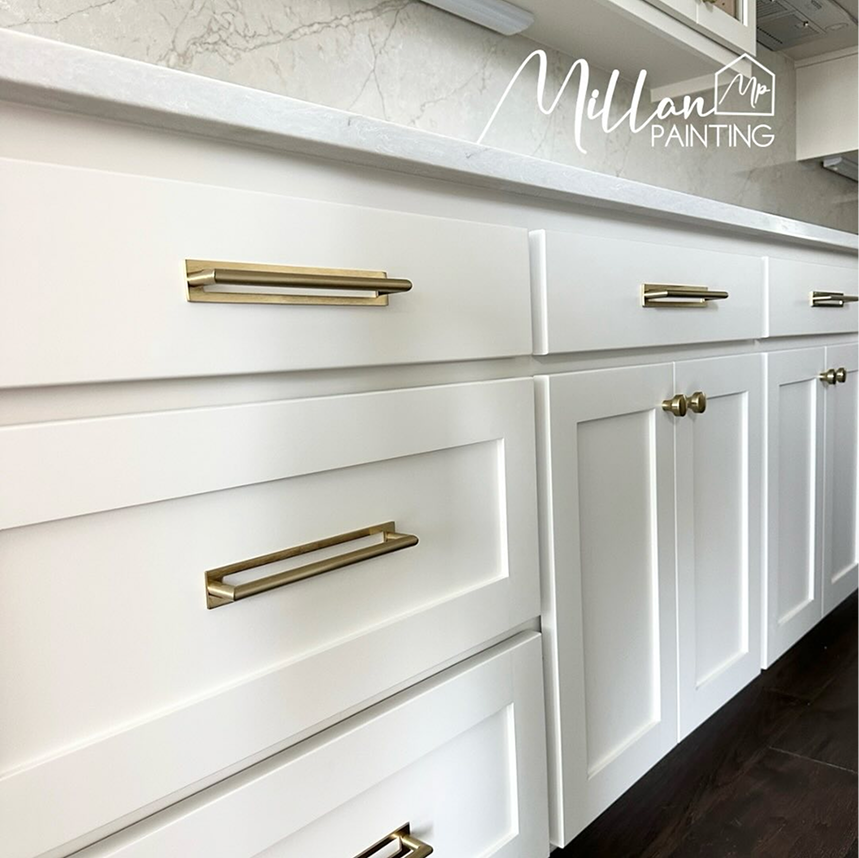
The Impact Of Trim, Accents, And Front Door Color
Trim and accent colors are what turn a good exterior palette into a complete one. They define rooflines, outline windows, emphasize architectural features, and bring shape to the whole composition. Without that support, even beautiful siding colors can look flat or unfinished.
The front door has a different role because it acts as a focal point. A rich wood stain, deep navy, muted red, or near-black finish can draw the eye and give the home personality without overwhelming the rest of the scheme.
Contrast level affects the final impression more than many people expect. High contrast tends to feel sharper and more contemporary, while lower contrast creates a softer, more blended look.
Your Home’s First Impression Starts With The Right Colors
The color palette you choose for your exterior shapes how your home is perceived long before anyone steps inside.
With so many moving parts, professional guidance can make the process clearer and the final result stronger.
For homeowners and commercial property owners across Orange County, Custom Painting & Decorating Inc. offers personalized service and skilled craftsmanship backed by a 2 year painting workmanship warranty.
To request an estimate or consultation, contact Custom Painting & Decorating Inc.